You strive to deliver the perfect email experience to your subscribers. But if you’re glossing over email accessibility, you could be alienating those with visual, physical, cognitive, and neurological disabilities.
Read on to learn how to make your emails more accessible for all of your subscribers.
What is email accessibility?
Accessibility is one of the founding pillars of user experience and design. Email accessibility means making sure that everyone can read, understand, and interact with your message, including people with disabilities and those who use assistive devices.
You can think of accessibility in email as an extension of dealing with email clients with poor support. Including workarounds and fallbacks ensures every subscriber receives a positive experience, helping you reach a wider audience and while building trust and loyalty with your subscribers.
What are WCAG guidelines?
The main standard for email accessibility is the Web Content Accessibility Guidelines (WCAG). These internationally recognized standards outline how to make websites, apps, and other digital properties accessible to people with disabilities. It was developed by the World Wide Web Consortium (W3C) under its Web Accessibility Initiative (WAI), and is updated to incorporate new accessibility considerations.
Most importantly, WCAG conformance means your business is meeting standards that are supported by U.S. and international accessibility laws. While WCAG isn’t a law on its own, it’s the widely recognized guide for making web and digital experiences accessible to everyone.
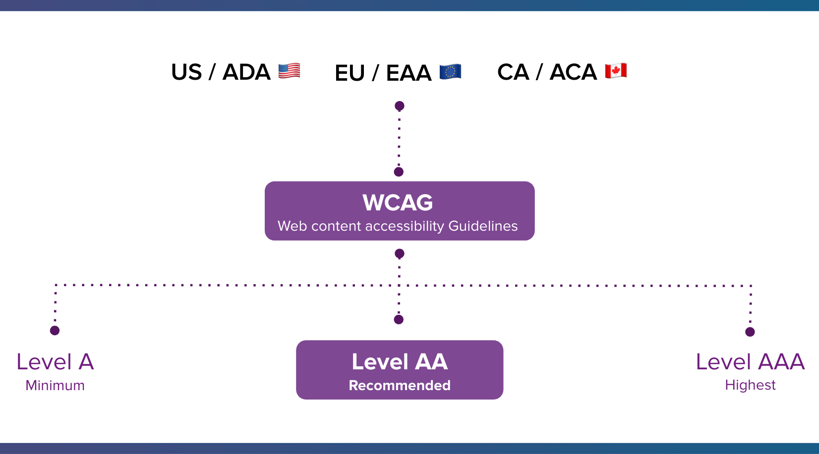
There are three levels of conformance:
- Level A (lowest): the minimum level of accessibility.
- Level AA (mid-range): includes all Level A requirements and more. Many organizations aim to meet this level.
- Level AAA (highest): includes all Level A, AA, and additional AAA requirements.
WCAG standards are based on four main principles, often referred to as POUR: perceivable, operable, understandable, and robust.
- Perceivable: information should be presented in a way that people can access through one of their senses, ensuring they can understand all related content.
- Operable: users must be able to interact with all elements of a webpage. For example, the site should be navigable using just a keyboard or voice controls, catering to non-mouse users.
- Understandable: web content and functionality should be clear and easy to understand for all users.
- Robust: your website must work well for all users, including those using assistive technologies, and remain compatible with evolving technologies and user needs.
Meet your pre-send email accessibility checklist
Run your email against 20 checks, aligned with the Americans with Disabilities Act (ADA) and European Accessibility Act (EAA).
Why does email accessibility matter?
Email is one of the most widely used ways people communicate, both personally and professionally. And it’s not going anywhere—by 2027, there will be 4.89 billion email users worldwide, according to Statista. Our own research has found that subscribers spend an average of 8.97 seconds with an email.
But despite email’s reach, accessibility is often overlooked. Here’s why making emails accessible to everyone is essential:
1. Disabilities affect a large share of the population—and that includes email users
One in four adults in the United States (U.S.) and European Union have a disability. On a worldwide scale, that number extends to one in six. Yet, accessibility challenges in digital spaces, including email, are often overlooked.
Here’s how some common disabilities impact email engagement:
- Vision impairments: according to the World Health Organization (WHO), at least 2.2 billion people globally have near or distance vision impairment.
- Color blindness: affects 1 in 12 men (8%) and 1 in 200 women (0.5%).
- Dyslexia: impacts 15% of people, making reading difficult for over 30 million adults in the U.S. alone.
- Cognitive disabilities: affect 13.9% of U.S. adults.
- Aging population: by 2030, 1.4 billion people will be 60 or older, often experiencing vision and cognitive changes.
- Situational disabilities: for example, a broken arm can limit an individual’s interaction with digital content.
If your emails don’t prioritize accessible design, you’re missing out on a huge audience—and potential customers.
Beyond disabilities, accessibility also helps those with limited internet access or older devices. Even in affluent countries, slow connections and old technology can impact a user’s ability to have a good user experience. Accessible design is one way to help mitigate these barriers.
2. Accessibility is a legal requirement
Over the years, governments worldwide have established accessibility laws:
- Americans with Disabilities Act (1990, U.S.) and Equality Act (2010, U.K.) helped set foundational accessibility requirements.
- WCAG and Section 508 provide web accessibility guidelines, critical for industries like healthcare, finance, and government.
- The European Accessibility Act (EAA), effective June 2025, expands digital accessibility standards.
Failing to meet these standards can result in legal issues—but more importantly, it excludes people who rely on accessible digital experiences.
3. Accessibility also helps drive business results
Email strategy, design, and development shouldn’t be driven by compliance alone. Making emails accessible expands your reach to a wider audience, including those who might otherwise struggle to engage.
Beyond being the ethical choice, accessible design also leads to stronger business outcomes. By making your emails accessible, you help reach a wider audience and boost engagement. The ROD Group estimates that people with disabilities (28.7% of adults in the U.S.) control over $1 trillion in annual disposable income—so if your emails aren’t accessible, you’re leaving revenue on the table.
Plus, with today’s tools and technology, there’s no excuse for inaccessible email campaigns. Prioritizing accessibility isn’t just the right thing to do—it’s a smart business move that improves the experience for everyone, including those with temporary impairments.
Types of disabilities to consider in email marketing
When it comes to email accessibility, it’s important to consider common disabilities like visual and hearing impairments, as well as cognitive or learning disabilities, and ensure screen reader accessibility for those with visual challenges.
Assistive technologies help people access content in different ways. For example, screen readers and magnifiers assist those with visual impairments, while head pointers or eye tracking support individuals with physical disabilities. Additionally, text readers or dictation software can help people with cognitive or learning challenges.
Accessibility made simple
Tune into our virtual event to learn how to create inclusive emails that look great and work for everyone—featuring two accessibility experts from Oracle Digital Experience Agency.
Accessibility best practices for email marketers
In this section, we’ll cover the best practices and considerations for make email accessible. Keep reading or jump ahead:
- Consider the visual aspects of email accessibility in your design
- Use color intelligently
- Don’t create harmful content
- Balance text and images
- Use larger font sizes
- Give copy space
- Avoid justified copy in your email
- Choose the right typeface
- Use semantic elements
- Improve the readability of your email
- Make links clickable/tappable
- Banish the “click here” link copy
- Use the ALT attribute correctly
Consider the visual aspects of email accessibility in your design
Let’s start by looking at the visual aspects of your email that can impact accessibility and where improvements can be made.
Use color intelligently
Subscribers with color blindness may not be able to differentiate between some colors in your email, so to ensure accessibility for color blindness, make sure color isn’t the sole method of conveying important information.
Color contrast can also pose issues to subscribers with visual difficulties. Use a high color contrast between different elements in your email, especially between copy and background colors. One way to do this is to use WebAim’s Color Contrast Checker to check the contrast ratio of the colors in your email.

Are your emails accessible?
See what your emails look like for visually impaired users using the color blindness filter in Litmus Email Previews.
Don’t create harmful content
Content that flashes at certain rates or in patterns, such as animated GIFs, can cause photo-sensitive seizures in some individuals. Avoid flashing content or including links to videos that may have similar content.
Looking to include an animated GIF in your email? Consider these guidelines to ensure they’re accessible:
How to create accessible animated GIFs in email
- Avoid harmful flashing rates. Ensure your GIFs do not flash between 2 Hz and 55 Hz to prevent triggering seizures in users with photosensitive epilepsy.
- Ensure readability for visually impaired users. Use smooth transitions or slow animation rates to give users enough time to read and comprehend the content before it changes.
- Provide ALT text for accessibility. Since GIFs are image files, include descriptive alternative text to help users who rely on screen readers understand your content.
- Offer alternative content when possible. Consider static image alternatives or text-based explanations for users who may struggle with animations.
- Test for accessibility. Use accessibility tools to check if your GIFs are perceivable and understandable for all users. With Litmus, you can check and remediate every email for elements that impact how subscribers with cognitive or visual impairments experience them.
Balance text and images
While sighted users can visually scan or skip over non-relevant content, blind users must listen to the entire content of the email, one email at a time. Tailor the written content in your email to deliver the main message. Also, consider how compatible your design is with popular screen readers.
Use larger font sizes
Anything smaller than 14 pixels on a desktop or laptop screen requires some effort to read. Users can increase the zoom level on their devices to help them read their screens, but this can have a negative impact on your email, which may appear broken or cut-off.
Text can appear smaller on mobile devices, forcing users to work harder to read your email. Use media queries to increase the minimum font size from 14 to 16 pixels on smaller devices to help users read your email:
@media screen and (max-width: 600px) { p.mobile {font-size: 16px;}}
For even more accessible typography, consider using rems instead of pixels for font sizes. Rems scale based on the user’s browser settings, ensuring text adjusts dynamically for those who have increased their default font size for accessibility. (Josh W. Comeau dives deeper on his blog.)
Whether to use them depends on your audience. Based on our findings, rems aren’t supported in Outlook and Yahoo/AOL, so they may not be the best choice for all subscribers. A tool like Litmus Email Analytics can help you determine what share of your audience is using these email clients to help you prioritize.
Give copy space
For some it can be hard to read paragraphs and blocks of text where the lines of copy are spaced close together. Set an appropriate line height on text to make it easier to read for all. We recommend choosing a line height that’s 1.5 times more than your font size. (Keep in mind: this will vary depending on whether you’re using rems.)
<p style=”font-size:14px; line-height:18px;>Paragraph with font-size and line-height set</p>
Tip: when increasing the font size for mobile devices, don’t forget to increase the line height.
Paragraphs of copy also need room to breathe to aid readability. When scanning an email it should be easy to identify paragraphs and be able to keep your place. Create enough white space above and below paragraphs.
One more step to make text easier to read is by moving it away from the edges of your emails. Adding padding to a table cell or paragraph tag will help you achieve this.
Avoid justified copy in your email
“Justified” copy means that letter and word spacing is adjusted so the text falls flush with both the left and right margins. While common in print, the inconsistent word-spacing can make justified copy hard to read. Text that is left-aligned has been proven to be easier to read for all.
Choose the right typeface
The use of web fonts has increased the pool of possible typefaces that can be used in email, but before you decide to use Lobster as your body font, think about how accessible it is.
When selecting the typeface for your email, choose one that is evenly spaced and not too condensed. This is a good idea not just for email accessibility, but for mobile users, too.
And, as always, make sure to include an appropriate fallback font for email clients where the web font isn’t supported.
Use semantic elements
Another key way to improve your emails’ readability and make your email code more accessible is by using headings to create a clear visual structure and hierarchy. This helps organize your content and makes it easier for subscribers using screen readers to navigate.
Coding for accessibility ensures your headings are properly structured, making it simpler for all users to follow the content. Here are some simple tips for using headings effectively:

- H1: Your primary headline (H1) should be styled in a way that makes it stand out—typically using a larger font size and heavier weight. This ensures it grabs attention and stands out against other elements.
- H2: For secondary headlines (H2), reduce the font size and consider additional styling, such as a lighter font weight or a different color, to differentiate it from your H1 and set it apart from the primary messaging.
- H3: For tertiary headlines, take the same approach, styling it as less dominant than your H1 and H2s. Ensure that each level of heading is clearly differentiated to create a visual hierarchy that’s easy to navigate.
Including semantic elements gives your subscribers who use screen readers the option to “scan” through an email by header. You can do this by using <p> and <h> tags. These are supported in every client, so it’s a good place to start making your email more accessible.
Historically, styling <p> and <h> tags hasn’t been easy, which is why it’s still fairly uncommon to see these tags being used in email. Margins around text wrapped in either of these tags was hard to manage, but using code like this you’ll be able to control that whitespace:
<h1 style=”mso-line-height-rule:exactly; margin:0; font-size:24px; line-height:28px;”>This is a title in an email</h1>
<p style=”margin:0; font-size:14px; line-height:18px;”>And this is the paragraph</p>
For semantic elements, use margin, not padding, as the padding attribute isn’t supported on these elements everywhere. As for rems, Josh W. Comeau gives guidance on his blog.
Tip: Using mso-line-height-rule:exactly; in your <h> tags will maintain line-height rule you set in Microsoft Outlook email clients.
Improve the readability of your email
Creating a more accessible and readable email isn’t only down to how the email is coded, but how the copy is written, too. Writing for accessibility involves making your email copy more human, which aids in readability and helps build a 1:1 communication between you and your subscribers.
The most popular test, known as Flesch-Kincaid Reading Ease test, can be found in Microsoft Word and calculates how easy your content is to read on a scale of 0-100. That means:
- A score of 90-100 will be easily understood by an 11-year-old student
- A score of 60-70 will be easily understood by 13- to 15-year-old students
- A score of 30-50 will be understood by college students
- A score of 0-30 will be better understood by university graduates
Making something more “readable” shouldn’t mean you shy away from tricky topics or weighty subjects. Rather than dumbing down your writing, it refers to the accessibility of the text. Opt for smaller words; if you’re not sure if everyone knows what a particular word means, refrain from using it.
For most businesses, your sweet spot is somewhere between 60 and 70 to capture a general audience. Of course, if your audience is highly educated, then don’t be afraid to use more complex language.
Some other points to consider:
- Keeping sentences to around 20 words or less.
- Edit your copy to be direct and to the point.
- Use active voice to keep the sentence structure simpler.
- Avoiding slang, jargon, or regional words that some people might be unfamiliar with.
Make links clickable/tappable
Ensuring the size of your bulletproof buttons are large enough to be used by thumbs and fingers on mobile devices will help with the accessibility of your email too. A bigger button will be beneficial to those who can’t control a mouse with precision.
Banish the “click here” link copy
Avoid using “click here” as copy for your links. Screen reader users often tab through content, skipping through it as a way of scanning an email. Giving your links context will help these users to decide if they want to click through or not.
For example, if you have a link that goes to a product listing of shoes, using link copy such as “See more shoes” lessens the ambiguity of the link for screen reader users. Reducing the ambiguity of links is beneficial for email accessibility, but really benefits all subscribers. It doesn’t require them to read the context surrounding the link, which helps for those who scan emails.
Banishing “click here” links will also move your email content to be more device-independent. “Click here” may make sense for a subscriber using a laptop or desktop, but not for someone using a mobile device or tablet where tapping is required.
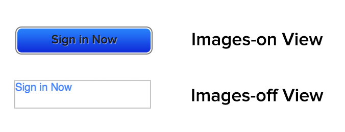
Use the ALT attribute correctly
The ALT attribute—used to display ALT text—has been an email best practice since the dawn of HTML emails, owing to email clients blocking images by default. The text used in an ALT attribute attached to an image displays when the image doesn’t load. This helps the subscriber “see” the email if they have images off by default in their email client or if they are using a screen reader to read the email.
To correctly use the ALT attribute, the context of the image must be fully understood in relation to the content surrounding it. First, you need to decide if the image is functional, illustrative, or decorative.
All images require ALT attributes, so a null ALT attribute should be used for images that don’t need to be read by screen readers or don’t represent anything vital to the subscriber.

Litmus email with images off

View your email with all of the images turned off to help you decide which images require the ALT attribute and which ones can have a null attribute.
For a deeper dive into understanding how context informs the use of the ALT attribute for your images, visit WebAim’s page on the ALT attribute.
Use role=”presentation” on all presentational tables
In email design, tables are used to hold content as well as structure the email’s design. Tables were never intended to be used for design. But due to restrictions in email clients such as Outlook, email designers have been forced to use the <table> element as a design element.
To help screen readers understand the difference between <table> elements that hold content and those that are purely for design, use role=”presentation” on each table that holds content the subscriber needs to read. You only need to add it to each <table> element, not every <td>. This avoids forcing a screen reader to read each cell of your tables one at a time and helps the subscriber get straight to the important content—and also improves the experience when subscribers choose to read emails aloud.
In addition to role=”presentation”, aria-hidden="true" is another HTML attribute that can be added to elements in your HTML that are for visual content and should be hidden from screen readers:
<table role="presentation" aria-hidden="true" cellpadding="0" cellspacing="0" border="0">
<tr>
<td></td>
</tr>
</table>
role="presentation" can also be used on images. It’s recommended to use the HTML attribute role=”presentation” on any image with an empty ALT attribute to avoid the name for the image being read.
Create emails that everyone can experience
Maximize your email’s impact by designing accessible content for all. Accessibility checks are always at your fingertips with Litmus.

Email accessibility in action
Let’s take a look at examples of accessible emails, submitted by the Litmus community.
Subscribers of this email will be able to increase the text size through their browser by up to 200% without breaking the design of the email. And it features an animated GIF that stops after three cycles (within five seconds) for those who suffer from photo-sensitive seizures.
Eyal Bitton created an email that uses copy for links that make sense out of context. They also signal to blind subscribers at the end of the email by using some hidden text.
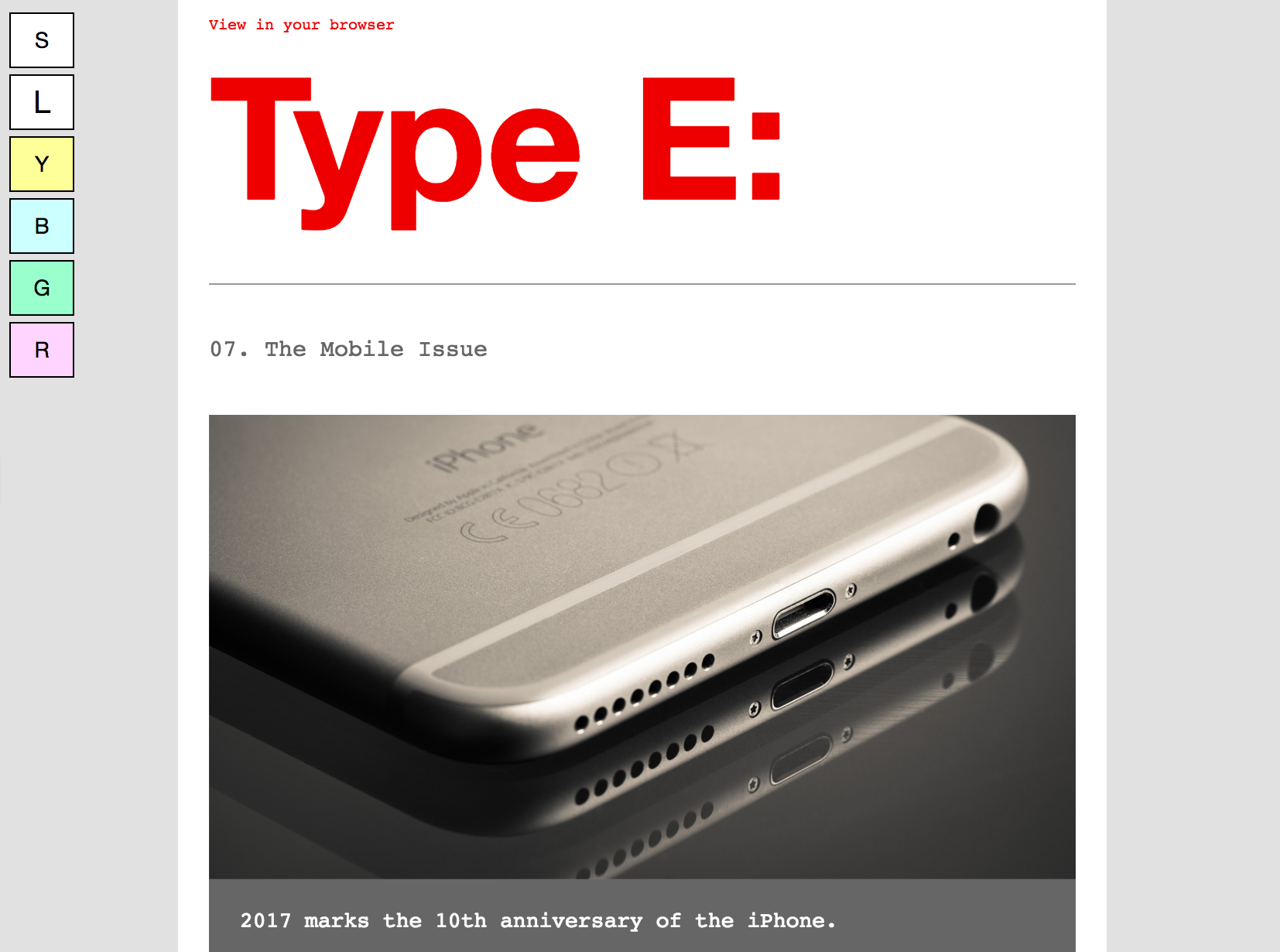
Type E’s newsletter uses an interactive progressive enhancement that enables the subscriber to choose from standard or large text size. Email developer Paul Airy also included an option–driven by an opt-in—where the subscriber can choose to display the email with tinted backgrounds if they suffer from certain disabilities.
These emails illustrate that it only takes a few small steps for emails to be more accessible and potentially reach a wider audience. Many of these steps not only aid accessibility but also help to improve your emails for everyone.
See your emails with images on and off
Want to see how your emails look in 100+ desktop, mobile, and webmail clients, including images-off views? Give email testing in Litmus a try, free! Try Litmus free →
Educate your teams to scale accessibility adherence
Making emails accessible is the right choice, but to get your team on board, you might need to show the business value. Email is a highly effective channel with an impressive ROI of 36:1, and people with disabilities control over $1 trillion in annual disposable income. Ignoring accessibility means missing out on a key group of potential customers.
Start by creating accessible email templates that follow best practices, like live text and strong color contrast, making it easier for your team to maintain consistency across campaigns. Regular training and continuous learning will ensure everyone stays up-to-date on accessibility standards.
By integrating accessibility into your campaign planning and collaborating with different teams—design, development, and legal—you can make accessibility a routine part of your process. This not only helps meet standards but also builds stronger, lasting relationships with your audience.
Accessibility tools for email marketing
Looking for tools to help make your email accessibility easier? Our built-in accessibility checker plus additional features can help make things easier for you:
Automatic accessibility checks
Scan your email for 40+ accessibility areas, with detailed reports and guidance on any issues found. With Litmus’ Email Builder, you can check your code as you work to ensure it meets your subscribers’ needs.

Visual impairment filters
Visual impairment filters offer four color vision deficiency options, allowing you to see how your email displays for subscribers with visual impairment.

NVDA screen reader preview
Our NVDA screen reader integration supports over 80 languages. The lang attribute helps screen readers accurately transcribe your message by indicating the language used to draft your email.
For more on accessibility testing in Litmus, visit our Help Center.
Start making a difference today
Maximize your email’s impact with Litmus to ensure accessibility and inclusivity for all subscribers — no matter their abilities.

Jaina Mistry was the Director of Brand and Content Marketing at Litmus.